Page 1 of 2
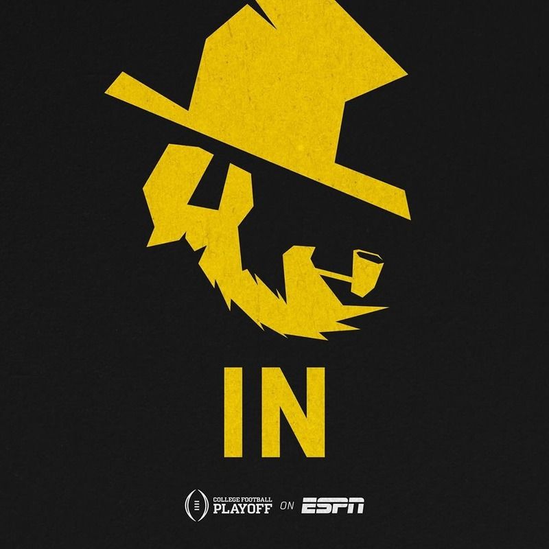
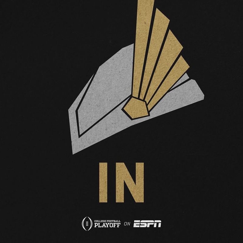
Now that's a Yosef Logo
Posted: Thu Sep 03, 2015 8:46 pm
by Appstate88
Outstanding! Now that's a Yosef Logo. What are your thoughts?
Re: Now that's a Yosef Logo
Posted: Thu Sep 03, 2015 9:00 pm
by HBTApps
I think it's great, but I think it needs a mean looking eye looking out
Re: Now that's a Yosef Logo
Posted: Thu Sep 03, 2015 9:00 pm
by APPARJ
Appstate88 wrote:Outstanding! Now that's a Yosef Logo. What are your thoughts?
I hardly ever like anything new.... but this is well done. It looks classic with a modern twist.
Re: Now that's a Yosef Logo
Posted: Thu Sep 03, 2015 9:01 pm
by Gnomeneer
If Yosef is looking the other direction, is that OUT?
Re: Now that's a Yosef Logo
Posted: Thu Sep 03, 2015 9:02 pm
by EastHallApp
Love it.
Re: Now that's a Yosef Logo
Posted: Thu Sep 03, 2015 9:09 pm
by Appstate88
If Yosef faces the other way, we have a winner!

Re: Now that's a Yosef Logo
Posted: Thu Sep 03, 2015 9:17 pm
by T-Dog
Re: Now that's a Yosef Logo
Posted: Thu Sep 03, 2015 9:18 pm
by NewApp
Appstate88 wrote:Outstanding! Now that's a Yosef Logo. What are your thoughts?
Gag. Too abstract for my taste.
Re: Now that's a Yosef Logo
Posted: Thu Sep 03, 2015 9:20 pm
by Appstate88
Our logo is the best!
Re: Now that's a Yosef Logo
Posted: Thu Sep 03, 2015 9:22 pm
by AppinVA
We have the best, by far. Not even close.
Re: Now that's a Yosef Logo
Posted: Thu Sep 03, 2015 9:29 pm
by HeffnerIV
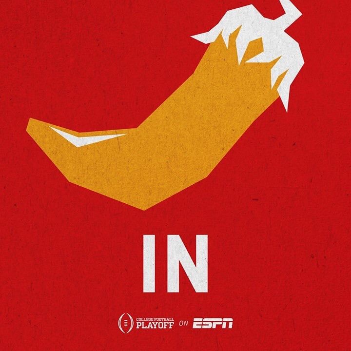
Ours is definitely the best. I like the Lafayette Jalapeños second.
Re: Now that's a Yosef Logo
Posted: Thu Sep 03, 2015 9:34 pm
by S.Lewis15
Love that it's a more contemporary stylized version of the old logo. It's definitely not "abstract"
It gives off a much more aggressive and rugged appearance.
I flipped the image for those wanting to see it facing the other way.

Re: Now that's a Yosef Logo
Posted: Thu Sep 03, 2015 9:45 pm
by AppinVA
S.Lewis15 wrote:Love that it's a more contemporary stylized version of the old logo. It's definitely not "abstract"
It gives off a much more aggressive and rugged appearance.
I flipped the image for those wanting to see it facing the other way.

He is the Mountaineer who says Ni. Which explains the shrubbery on the hill above the stadium.
Re: Now that's a Yosef Logo
Posted: Thu Sep 03, 2015 10:49 pm
by Dmanuhone
xx
Re: Now that's a Yosef Logo
Posted: Fri Sep 04, 2015 8:56 am
by proasu89
AppinVA wrote:S.Lewis15 wrote:Love that it's a more contemporary stylized version of the old logo. It's definitely not "abstract"
It gives off a much more aggressive and rugged appearance.
I flipped the image for those wanting to see it facing the other way.

He is the Mountaineer who says Ni. Which explains the shrubbery on the hill above the stadium.

Beat me to it.
Re: Now that's a Yosef Logo
Posted: Fri Sep 04, 2015 9:10 am
by appstate77
proasu89 wrote:AppinVA wrote:S.Lewis15 wrote:Love that it's a more contemporary stylized version of the old logo. It's definitely not "abstract"
It gives off a much more aggressive and rugged appearance.
I flipped the image for those wanting to see it facing the other way.

He is the Mountaineer who says Ni. Which explains the shrubbery on the hill above the stadium.

Beat me to it.
"Help, help I'm being repressed!"
"It could be an African Swallow!"
Sorry, couldn't help myself

Re: Now that's a Yosef Logo
Posted: Fri Sep 04, 2015 9:52 am
by /\PP ST/\TE GRAD 09
I would happily take this on the helmets over the new rendition of the old yosef we currently have at times. Nothing beats the block A. Nothing branded us more than Dexter Jackson on SI with that block A on the helmet.
As long as we keep the block A, I will be OK with all other alternative logos.
Re: Now that's a Yosef Logo
Posted: Fri Sep 04, 2015 12:54 pm
by proasu89
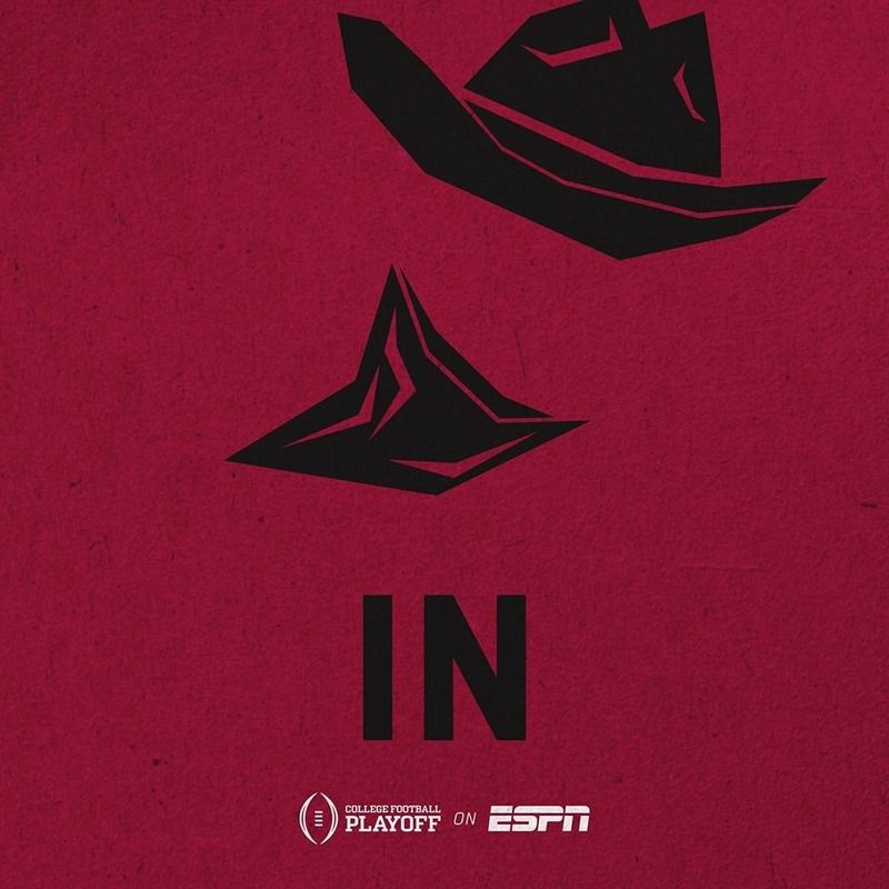
Pistol Pete looks like the invisible man.
Re: Now that's a Yosef Logo
Posted: Fri Sep 04, 2015 12:57 pm
by MtnDevil95
Someone said to me that it looks like a strange furry animal trying to eat a hat while pooing a pipe out of its backside.
Even still, I like it.

Re: Now that's a Yosef Logo
Posted: Fri Sep 04, 2015 11:02 pm
by NewApp
/\PP ST/\TE GRAD 09 wrote:I would happily take this on the helmets over the new rendition of the old yosef we currently have at times. Nothing beats the block A. Nothing branded us more than Dexter Jackson on SI with that block A on the helmet.
As long as we keep the block A, I will be OK with all other alternative logos.
I'm with you on the white block A as even a national brand. I got disses for saying that a few weeks ago.

I like good quality creativity and logical change as much as anyone but don't fix what is not broken and dance with the one "what brung ya"
Beat me to it.